We have rebranded the top internet provider in the region
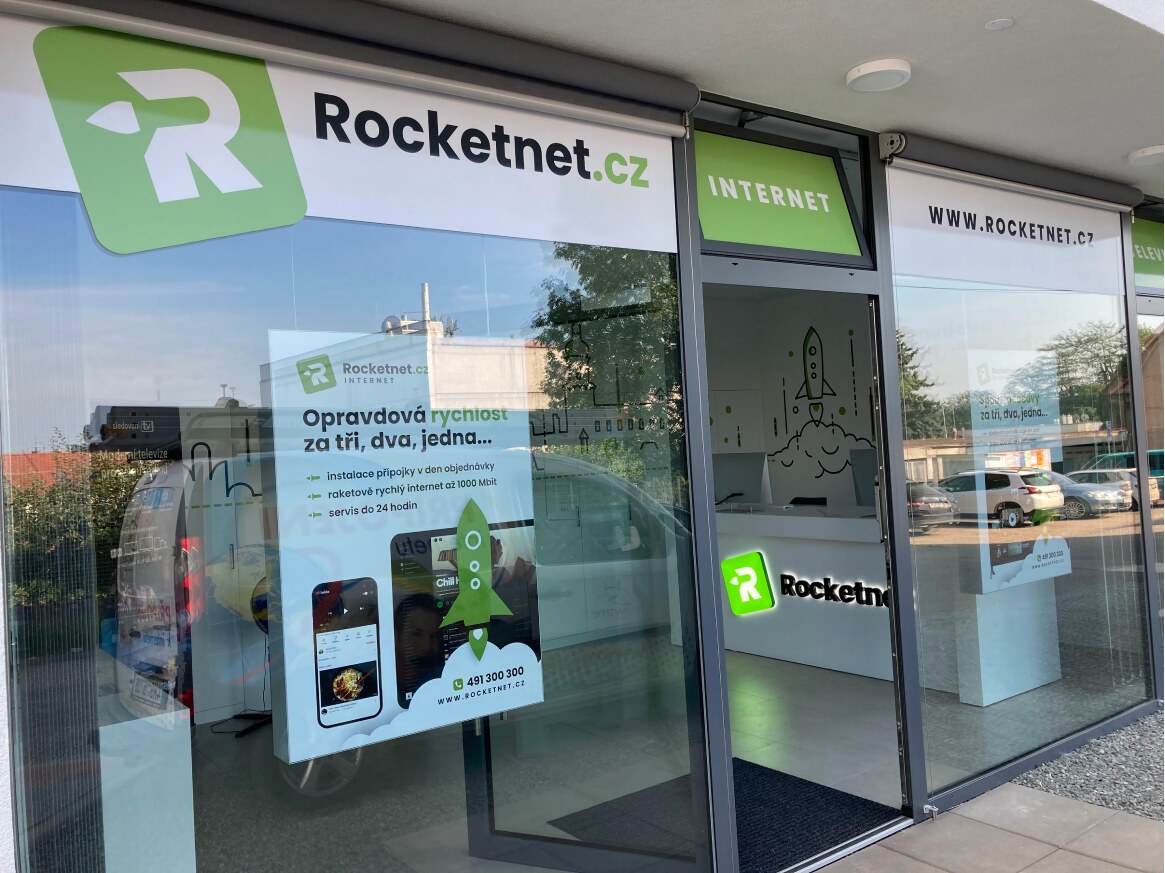
Logo and Visual Identity
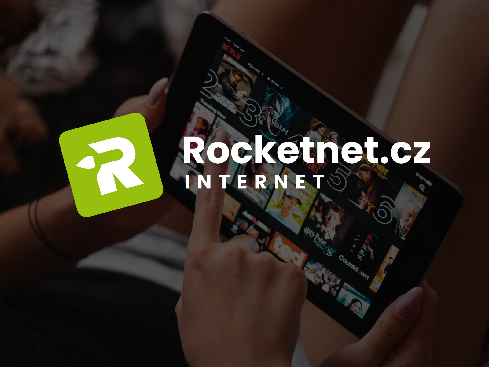
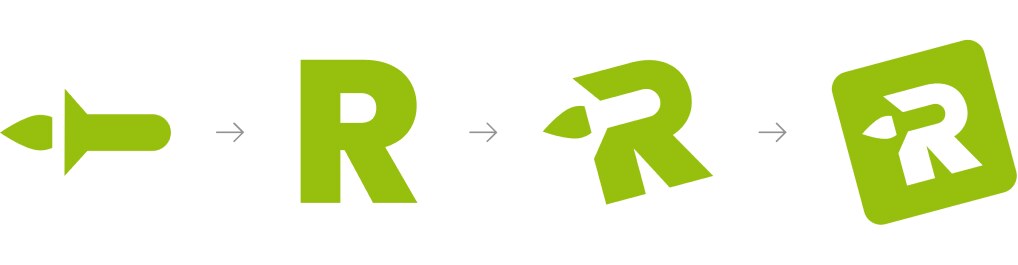
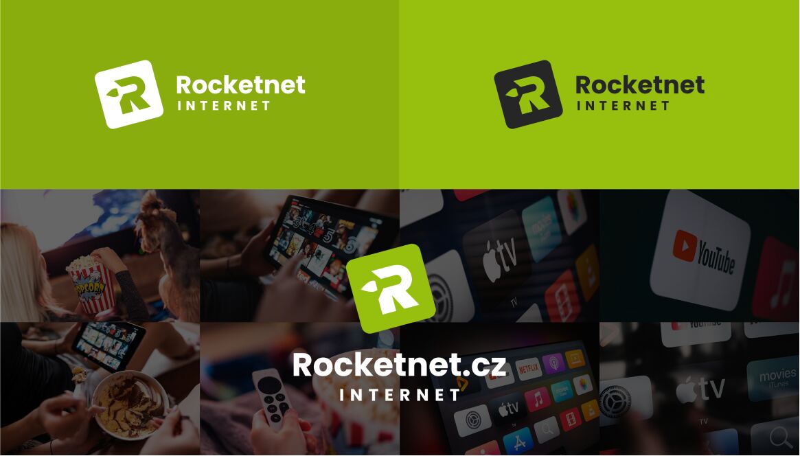
A modern dynamic logo that connects the letter "R" and the rocket symbol represents the essential element that an Internet provider must offer - speed. The embedding of the rocket symbol into the letter in its negative space adds depth to the logo and is a sign that connects the entire visual identity. The striking green color gives a modern look and makes the brand stand out among the competition.
![]()


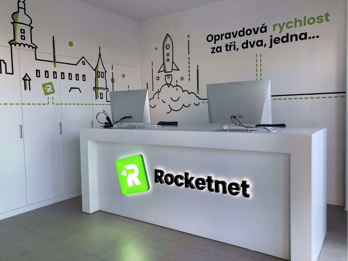
Design in the Interior of the Contact Center
The contact center in Nové Město nad Metují is a space dominated by white color. The striking branding we designed for this place utilizes large formats of cut vinyl stickers. Large impactful slogans, logos, and especially line graphics of the stickers representing the connection of Rocketnet to the region bring the necessary color, and the brand is unmistakable throughout the whole space.


Entrust your brand to experts.
Branding and visual identity clearly identify your company. They communicate your goals, values, and last but not least, the quality of your products and services, which make customers like and trust you.
Get in touch with us
Contact form template
 Welcome, I am AIadin, your guide on our website ✨